hackAIR: A review

hackAIR started in 2016 as a project to develop an open technology toolkit for citizens’ observatories on air quality. It was supported through the EU programme on “Collective Awareness Platforms for Sustainability and Social Innovation” until December 2018.

As we’re coming to the end of the project, we want to celebrate some of the highlights with you: three years hackAIR in action!

Beginnings: 2016

Here is how hackAIR started – some quotes from the project announcement: 

“The hackAIR toolkit aims to complement official data with a number of community-driven data sources. […] ‘This crowd-sourced air quality data will provide citizens with improved information about air pollution levels where they live.’ […] The combination of both official open and community-driven data will thus contribute towards both individual and collective awareness about air quality in Europe.”

We asked: What do citizens need to monitor air quality in their neighbourhood?

Requirements for the hackAIR platform were co-created in workshops with interested stakeholders, in Norway and in Germany. These were the first steps in a well-designed process focusing on user participation and engagement.

Looking back at the first nine months, the hackAIR team reported:

“Nine months have passed since the hackAIR kick-off meeting took place… and we have been busy since! Co-creation workshops, the first technical services on image analysis and data retrieval, privacy impact assessment for users and stakeholders and testing air quality estimation with existing sky-depicting images available on social media.”

Prototypes and development: 2017

At the Digital Social Innovation Fair in February 2017, latest news from the hackAIR team were presented, including an early prototype of the hackAIR Arduino sensor that showed real-time measurements of the air quality. And, as you see: the panel conversation was captured in visuals!

Behind the scenes of hackAIR during 2016 and 2017, the different parts of the hackAIR platform and app were taking shape. Pilot activities and ways to engage users were prepared.

Ready for action: 2018

The big moment: the official launch on February 8!

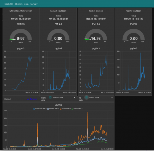
Since its launch, the hackAIR platform has engaged thousands of Europeans. They are monitoring air quality in their neighbourhood in various ways: providing air quality measurements to the platform with their own self-built sensors and taking photos of the sky with the hackAIR app to estimate the air quality.

Pilot projects in Germany and Norway contributed with a series of workshops to raise awareness of air quality issues and mobilise health-conscious communities. Participating in such a sensor-building workshop created behaviour change regarding air pollution.

A workshop toolkit was designed to support workshop facilitators, providing a number of resources for all who want to organise their own hackAIR workshop.

The hackAIR tech team prototyped an innovative way to get estimations of the air quality. The hackAIR app includes a feature for taking photos of the blue sky. The analysis process provides an estimation of air quality to the user.

The summer photo contest resulted in 208 submissions from 5 countries (an 367% increase in daily photo submissions during the contest period).

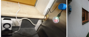
To make it even easier for citizens to measure air quality, hackAIR offered plug-and-play hackAIR air quality sensors – no soldering, no programming!

The outcome: 100 sensors sold in 3 months! Next batch being prepared for 2019!

Together with the artist collective Pollution Explorers and Umbrellium, hackAIR was able to try out wearable technologies and new engagement approaches in its workshops.

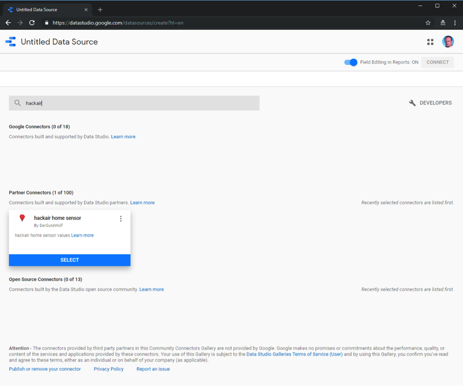
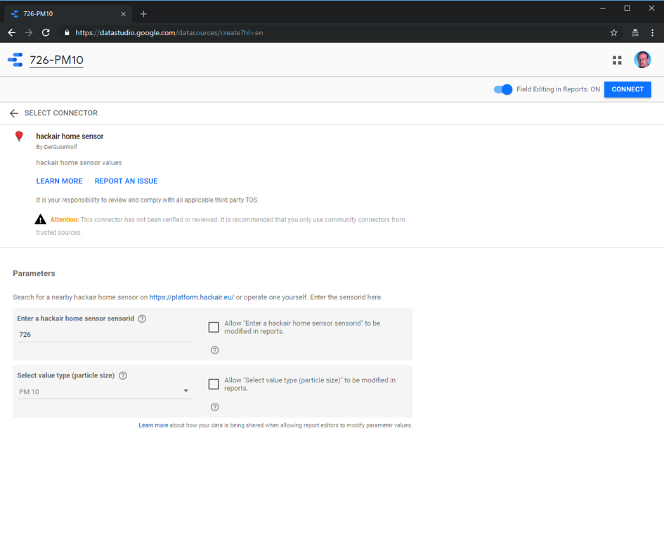
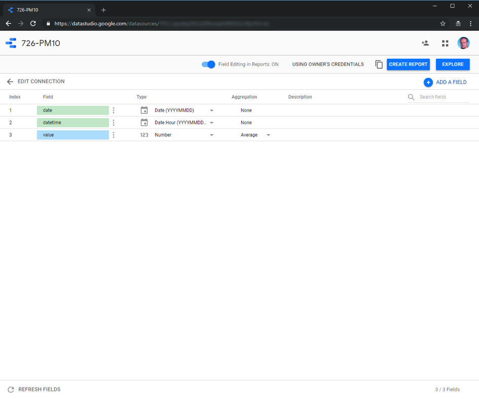
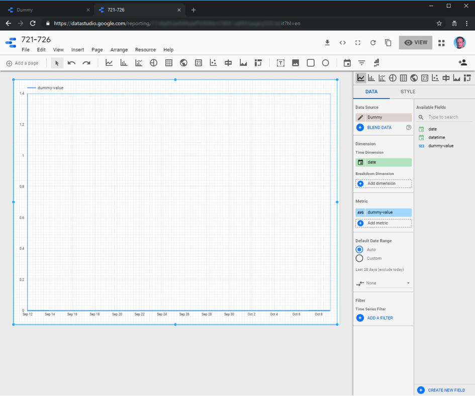
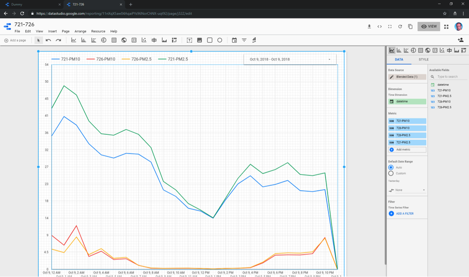
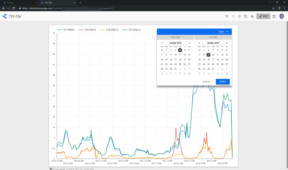
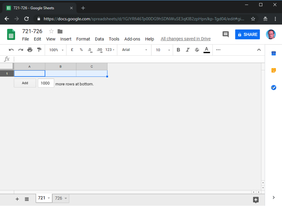
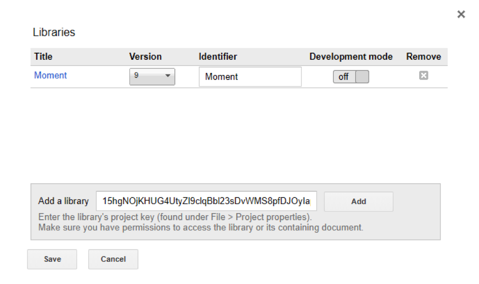
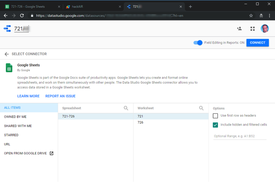
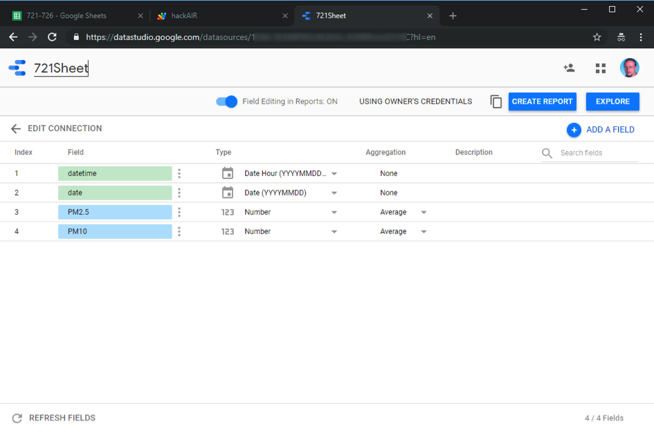
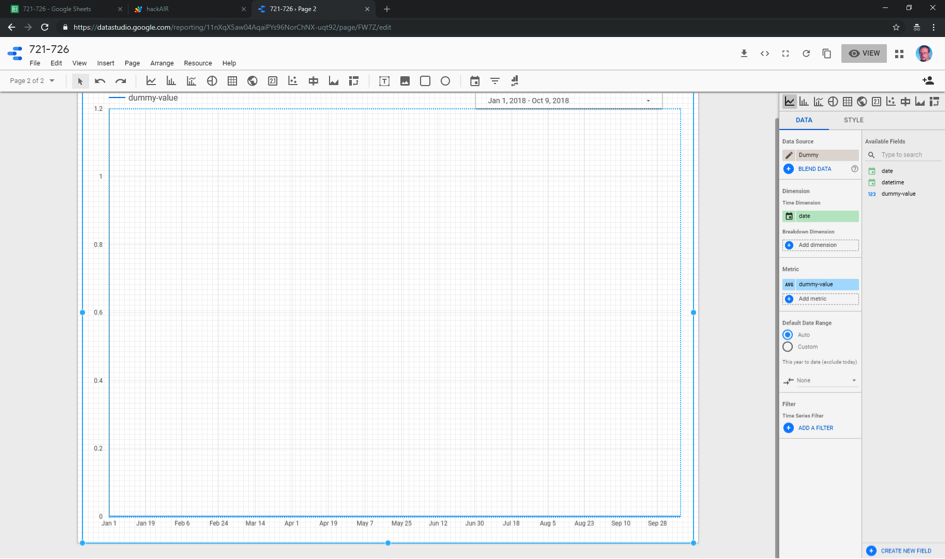
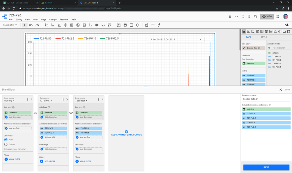
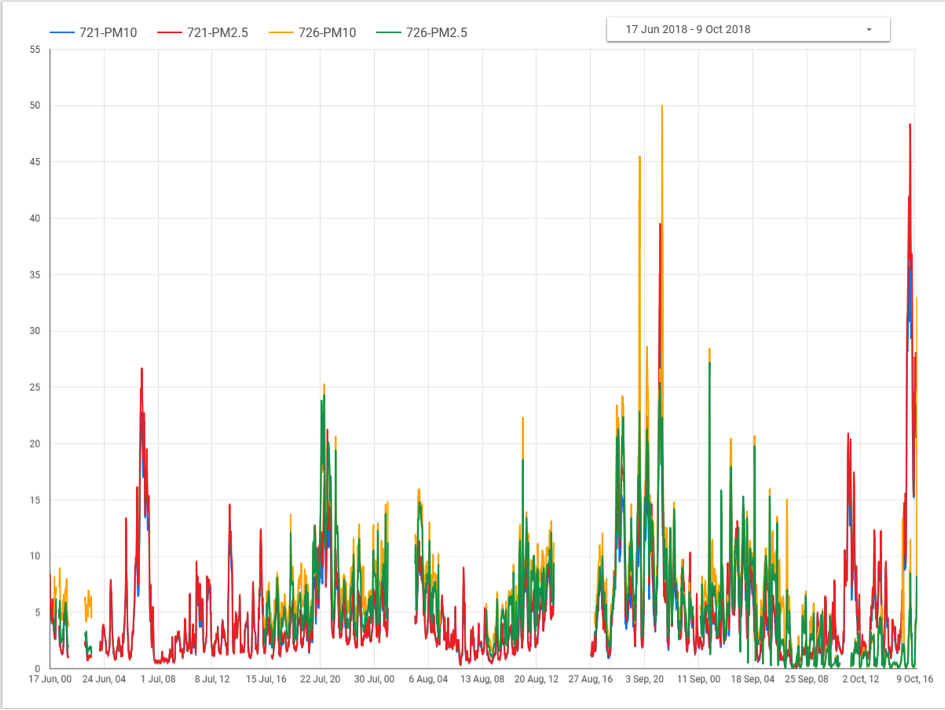
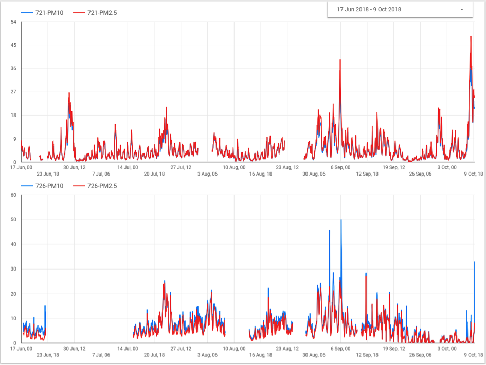
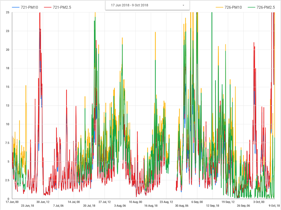
We published a series of blog posts on data visualisation and sense-making for those who are interested in visualizing their hackAIR sensor data. hackAIR users shared exciting experiments with us: Kniwwelino, Google Data Studio, Google Sheets & other tools.

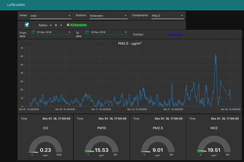
A data fusion algorithm calculates estimates for air quality for locations in which no measurements are available. This makes it possible for hackAIR  to provide a continuous map of air quality information.

A Round Table on lower cost air quality sensors was organised by the Joint Research Centre & hackAIR. Governmental authorities, citizen science initiatives, environmental NGOs & academics explored how to collaborate & better leverage each other’s work. Read more here: http://bit.ly/2qxTBQv 

This event showed the strong network of stakeholders and related projects that hackAIR has built during its project time.

Onwards! 2019++

The hackAIR platform remains available! Citizens can continue to contribute air quality measurements and access air quality information through the mobile app or web platform. Air quality data can be accessed using an open API – and the full datasets of measurements are available as open data. Source code and hardware designs are available for download under an open licenses and incorporate dozens of community suggestions and improvements.

Data visualisation with Node-RED Dashboard

Here is a special treat for hackAIR users who are interested in more ways to visualise their sensor data. We have received this awesome work from Jo Torsmyr, a hackAIR user from Norway. Here is what he sent us:

I am using Node-RED and Node-RED Dashboard to collect and visualize data from my hackAIR sensor. The hackAIR dashboard for my sensor can be found here: hackAIR Bislett dashboard 

The hackAIR dashboard compares air quality data (PM 2.5) from the hackAIR sensor, the nearest air quality measurement station from Luftkvalitet.info (Kirkeveien), and my indoor air quality measurement station, a Foobot air quality measurement device. The dashboard shows the latest readings in gauges, and historical measurements in graphs. Time period (from and to date) for the graphs can be selected as desired.

Here is a snapshot from my dashboard:

Technical information

My hackAIR dashboard runs in the cloud and is implemented with Node-RED flows and the Node-RED Dashboard, running on a Node.js server. Node-RED flow runs every 5 minute to collect newest sensor readings. The sensor data from my hackAIR sensor (and the Foobot sensor device), is stored in a Cloudant NoSQL database. The dashboard gauges is automatically updated with the newest sensor data. The database is used to get historical data for the graphs.

Node-RED flow

Here is a screenshot of the main Node-RED hackAIR flow:

Generic dashboards: Open AQ and Luftkvalitet.info

I have also created generic dashboards for Open AQ and Luftkvalitet.info for visualization of air quality measurements from their stations.

You can find the Open AQ dashboard at this link. Here is a screenshot:

The Luftkvalitet.info dashboard is here. A screenshot is added here:

Node-RED air quality nodes

I have created specific Node-RED nodes for Open AQ and Luftkvalitet.info for easy consumption from Node-RED if you want to roll out your own visualization or computation. Check out the Node-RED Open AQ nodes and the Node-RED Luftkvalitet.info nodes.

Have fun with this newest addition to the data visualisation tools on the hackAIR website!

hackAIR workshop in a primary school

Bring together in one room: 21 enthusiastic kids, an air quality expert from the VUB (Free University of Brussels), smartphones in the classroom and many empty drink cartons to build their own cardboard sensors. These were the ingredients for the hackAIR workshop at a primary school in Brussels – a big success!  

What do you already know about air quality? How is the air quality in your city, around the school, in your street? And what could you do next week for a better air quality in your neighbourhood?

The 8-10 year old pupils were very eager to answer, discuss and explore these questions using the hackAIR platform. Carina Veeckman (VUB) did a great job in explaining and guiding the children into the world of air quality. And well: they had so many questions!

After a round of theory and platform exploration the kids went outside to take photos of the sky with smartphones and tablets. And so they did the next day (and the next day…)

In the next round they were ready to build their own hackAIR cardboard sensor. Cutting, folding, bending, coating.

At the end of the afternoon 6 sensors were placed at the school gate and several more taken back home to measure the local air quality in the children’s neighbourhoods.

And finally the kids made posters to convince all the parents of the school to act for better air quality. What convincing activists they are!  

This workshop was co-hosted by Inge Jansen (ON:SUBJECT) and Carina Veeckman (VUB). This workshop report was written by Inge Jansen.

How to upgrade your hackAIR sensor

The hackAIR project is slowly coming to an end! While our servers will still remain live for a while, we want to make sure you can continue to use your own sensors as long as possible. For that purpose, we have started a collaboration with OpenSenseMap and created an improved version of the software running on our sensors that sends measurements to both OpenSenseMap and hackAIR.

Below are the step-by-step instructions to upgrade your hackAIR sensor with the new software version. Note: We’ve tested the new software, but we provide these instructions without guarantee. If you have suggestions to improve them, let us know!

3 Steps to upgrade your sensor and make it compatible with OpenSenseMap:

Step 1: Get your access keys

  • Go to https://opensensemap.org and create an account (→ Register)
  • Register your sensor ( → New SenseBox),  select hackAIR as the sensor type and take note of your senseBox ID and senseBox access token.
  • Go to your profile on http://platform.hackair.eu and take note of your hackAIR access key as well.
  • Connect the sensor to your computer with a micro-USB cable.

Step 2: Upgrade your sensor

These instructions assume that you have installed hackAIR software on your sensor before. If this is your first time, start with Step 2a below before continuing here.

  • Open the Arduino IDE and install the following additional libraries (Sketch ➞ Include Library ➞ Manage Libraries…)
    • Adafruit_MQTT Library by Adafruit
    • ArduinoJson by Benoit Blanchon (Attention! Use version 5.13.2, not version 6)
    • ESP8266 InfluxDb by Tobias Schürg
  • Download the new hackAIR sensor software from https://github.com/hackair-project/hackair-v2-advanced and open it. Then upload it to your sensor using Sketch → Upload. That’s it!

Step 3: Connect your sensor to your WiFi

  • Disconnect the sensor from the computer. When you power it up, it will create a temporary WiFi network. With your laptop or phone, connect to the WiFi network ESP-wemos. Go to 192.168.4.1 and configure the WiFi by entering the details of your home WiFi (SSID and password).
  • You will also be asked for your hackAIR access key and your OpenSenseMap credentials (senseBox ID and senseBox access token).
  • Once set up correctly, the temporary network will disappear and the sensor starts sending measurements to both platform.hackair.eu and opensensemap.org.

Happy measuring!

——————————————

Step 2a: If this is the first time installing software on your hackAIR sensor

  • Download, install and open the Arduino IDE
  • add the board manager http://arduino.esp8266.com/stable/package_esp8266com_index.json
  • Go to Tools ➞ Board ➞ Boards Manager… and select LOLIN(WEMOS) D1 R2 & mini
  • Select the correct port by going to Tools ➞ Port ➞ [name of the port]
  • Install libraries. Click on Sketch ➞ Include Library ➞ Manage Libraries… and install the following libraries:
    • WiFiManager by tzapu
    • DHT sensor library by Adafruit
    • Adafruit Unified Sensor by Adafruit
    • hackAIR by Thanasis Georgiou

Air quality data fusion on a local scale

This blog post has been written by Philipp Schneider, researcher at NILU (Norwegian Institute for Air Research). NILU is one of the hackAIR project partners.

The hackAIR project brings together air quality information from a wide variety of data sources. This includes data from low-cost sensor systems, air quality estimations based on sky photos,  and air quality monitoring stations equipped with reference instruments. These data sources exhibit widely varying levels of accuracy and often measure quite different variables. In order to make sense of such heterogeneous information and to provide air quality information at locations where no measurements are available, the hackAIR project has developed a data fusion method. The method is based on geostatistics, a specific class of statistics that enables analysis and prediction of data connected to place and time.

This data fusion method can merge the various observations as well as model information resulting in a value-added map of air quality. Data fusion has been used in the hackAIR project primarily at the country-level and at relatively low resolution in the order of several kilometers.

Based on the existing maps, we wondered: can we increase the level of detail in these continuous maps? To find out, we conducted experiments with local-scale data fusion in recent months. For a case study in the city of Oslo, Norway we adapted the hackAIR data fusion framework to operate at very detailed spatial scales. We used the output of an urban-scale air quality model and the observations made by the network of hackAIR low-cost air quality sensors as well as information from official monitoring stations and applied the data fusion algorithm. The results are high-resolution up-to-date maps of urban air quality that take into account the measurements from a dense observation network. Such maps can be updated very frequently, whenever new observations are available. The maps represent a raw dataset for providing a wide variety of services including:

  1. real-time estimation of air quality at a user’s current location
  2. personalised exposure estimates along a previously taken or planned path through the city
  3. air-quality aware routing for cyclists and pedestrians: suggestions for alternative directions based on the lowest air pollution


This is an example output of local-scale data fusion for the area of Oslo, Norway. We fused model output of PM2.5 with PM2.5 observations from the hackAIR sensor units (circles) and air quality monitoring stations (squares), resulting in an up-to-date high-resolution map of air quality.

While the initial results of the case study look promising, more research is needed to ensure that this data fusion method works in a reliable way also at the very local scale. Once this is accomplished, the method will allow for providing personalized and hyper-local information on air quality to support users in making informed decisions.

Let’s compare readings from two sensors

By Wolfgang Röckelein

After I had assembled two hackAIR sensors together with my two sons and put them just outside their windows we started wondering in our family: how could we (or our neighbors) profit more from the sensor? What are the daily and weekly variations of the values of your sensor (or your sensor compared to other hackAIR home sensors)?

To learn about variations in our sensor measurements, this blog post prompted me to some more experiments with Google Data Studio and Google Sheets (yeah, I know, it’s Google, but first the sensor readings are no personal data, and second Google Data Studio and Google Sheets is available for free and have some nice and useful features for our purposes and is completely online, so no installs necessary). Instead of using data.world and (secret) sensor access keys, I built an open source Community Connector for Data Studio using the same API as in my hackAIR Kniwwelino project, thus the sensor identification is via sensor ID. As the API fetches no more than 5000 data points, therefore the connector fetches the data day-by-day. Each fetch takes around 10-15 seconds. The connector caches fetched values, but only for at most 6 hours due to Google Script limitations. See this post for a solution for this, but at first I will show how to compare PM2.5 and PM10 readings for two sensors from yesterday with Google Data Studio.

bp1

  •  Click on Select. Type in a sensor id, choose a particle size and name your data source at the top of the window accordingly:

bp2

·       Click on Connect:

bp3

  • Click on the icon top left and do the same for the second particle size and likewise for the second sensor id and its two particle sizes. Do this again one more time for an arbitrary sensor id and particle size “Dummy” (the data connector only delivers data where data exists in order to provide a solid ground for further aggregation. However, data blend needs a lead with a complete timeline and the Dummy source provides such a lead). You should now have five data sources. At the final dummy data source creation click on create report instead of the data source icon. 
  • Give your report a name (you can adjust layout and theme also), choose Time series and draw a rectangle covering the report area:

bp4

  • Add a data range control and choose yesterday as the default data range:

bp5

  • Click on Apply and click on the time series chart. Click on Blend Data for data fusion of the four data sources. Replace date by datetime on the Dummy data source. Remove the dummy-value field. Add all remaining four data sources and name the value fields appropriately. Make sure that Date Range is for all five sources set to Auto (i.e. use our date range control).

bp6

  • You could give your data blend also a name. Click Save and Close. Add the four then available metric fields to the report.

bp7

  • You have now a report comparing two hackAIR home sensors and two value types. Choose View and select some more days at the date range control (not too much in order not to get timeouts…) and click on apply

bp8

  • Choose the Share this report icon and click on the upper right text to get a link to provide to other people or to use in a web page to display this report. Click on Edit and choose File/Embed and selecting Enable Embedding in order to get a HTML snippet or a URL to include in a web page. You can also use the URL to construct a HTML code which can be used to embed a thumbnail with a link to the full report page inside an HTML page.

Sample html code

hackAIR 721-726

To visualize larger timescales, check out Larger date ranges need a better cache 

For more data visualizations built on top of the hackAIR air quality data, see our overview post

Make even more sense of your hackAIR home sensor data

In March, we published a first story on visualizing hackAIR data. hackAIR users have started taking data visualization into their own hands – here’s an overview of exciting experiments we’ve found so far.

A simple display using Kniwwelino. How to combine a small electronic device used in education with data from your hackAIR home sensors to build a simple LED display for your family and neighbours.

Let’s compare readings from two sensors. How to use Google Data Studio to compare PM2.5 and PM10 readings for two sensors from yesterday.

Larger date ranges need a better cache. How to use Google Sheets to overcome API limitations and store data to visualize larger time scales.

Happy experimenting with Kniwwelinos, Google Data Studio, Google Sheets and other tools for your (and our) hackAIR home sensor readings!

A simple display using Kniwwelino

By Wolfgang Röckelein

After I had assembled two hackAIR sensors together with my two sons and put them just outside their windows we started wondering in our family: how could we (or our neighbors) profit more from the sensor? What are the daily and weekly variations of the values of your sensor (or your sensor compared to other hackAIR home sensors)?

We had been experimenting with some Kniwwelinos, and started using them as an addition to the hackAIR home sensor. A “Kniwwelino” is a small and cheap computer device for use in education. They come from Luxemburg, and have some nice features making them an ideal companion to the hackAIR home sensor: They have Wifi connectivity, a 5×5 LED matrix, a RGB LED and two buttons, are USB-powered and are cheap (around 12€). Plus they use the same CPU and development environment as the hackAIR home sensors!

I developed a script for the Kniwwelino to regularly obtain the most current readings of one hackAIR home sensor from the hackAIR platform (no need to change anything on your hackAIR home sensor and your neighbors could use the same approach to see the measurements). The index value (very good, good, medium and bad) sets the RGB LED color to green, yellow, orange and red respectively and when you press a button you see either the PM2.5 or the PM10 reading from your sensor as scrolling text on the LED matrix. The script is public source, so feel free to get one (or two or three…) Kniwwelinos to get an up-to-date display on your hackAIR home sensor readings. You need an USB power supply and should use a mechanical clock timer so the Kniwwelino is only operating when you are awake and at home in order to conserve energy. You can programme the sensor ID the Kniwwelino should use and the ID is stored in flash memory, so it is used when the clock timer repowers the device.

For more data visualizations built on top of the hackAIR air quality data, see our overview post.

Larger date ranges need a better cache

By Wolfgang Röckelein

This post builds on Let’s compare readings from two sensors.

Ok, well done. BUT: this only works for small date ranges, for bigger date ranges you will get timeouts. Therefore, we need a better cache for the API request results. We will use Google Sheets for storing the complete readings of hackAIR home sensors. Google Sheets can also be a Google Data Studio data source. Google Sheets is scriptable and we will use the already well known hackAIR API in a Google Sheets script to regularly update a Google Sheet with the newest sensor readings.

  • Start Google Sheets at https://docs.google.com/spreadsheets/ Create a new Spreadsheet and give it a nice name at the top. Use the desired sensor ID as the Sheet name at the bottom. A spreadsheet has a limit of two million cells; each reading takes three cells (datetime, PM2.5, PM10). So better use a separate spreadsheet for each sensor in order not to hit this limit, if you stay inside the limit you could use one spreadsheet with e.g. two sheets one for each sensors.
  • Delete all columns except A, B and C in all sheets. Delete all rows except the first row in all sheets. Result should look like this:

bp9

  • The URL should look like this, record your xyz value.

https://docs.google.com/spreadsheets/d/xyz/edit#gid=0

 
  • We will now use this script to do the initial fill and regular update of your Google Sheets. In your sheet, choose the menu item Tools/Script editor. Give your script a name in the upper left corner (e.g. hackAir) and replace the initial code with the empty myFunction with the code from the link above (click on the Raw button, the use control-a and control-c to copy the code, switch to the script editor and use control-a and control-v to paste the code). Replace xyz in the fourth line with the recorded value from above and replace the date in the third line with your desired start date. 

https://github.com/DerGuteWolf/hackair-googlesheets-script/blob/master/Code.gs

  • Choose Menu > Resources/Libraries and add the Moment library by entering 15hgNOjKHUG4UtyZl9clqBbl23sDvWMS8pfDJOyIapZk5RBqwL3i-rlCo and clicking Add. Choose the most current version.

bp10

  • Click Save to save the script. Execute the script with the run button. Grant the script the permission to access your Google sheet, choose “Advanced” and “Go to hackAIR (unsafe)” and then “Allow”. 

bp11

bp12

  • Be prepared that this will take some time (as I already wrote one call per day and sensor and a single call takes a while)! You might need to run the script more than once because of timeout problems. At the end all of your sheets should contains datetime values and sensor readings from the date entered up to the current day. 
  • To schedule the script to run regularly choose menu entry Edit/Current Script’s Triggers. Click the link to add a trigger:

bp13

  • Click Save. With this setting the sheet will auto-update itself each night.
  • Go back to your data sources of Google Data Studio (https://datastudio.google.com/navigation/datasources?hl=en). Click on the plus button in the lower right and select the Google Sheets connector. Choose your Spreadsheet and the first sheet. Deselect “Use first row as header” and name your data source in the upper left.

bp14

  • Click Connect. Duplicate the first field (with the three dots menu next to the name). Name the first field datetime and choose Date Hour as type. Name the second field date and choose Date as type. Name the third field PM2.5 prefixed by the sensorid and choose Average as the Aggregation. Name the forth field PM10 prefixed by the sensorid and choose Average as the Aggregation.

bp15

  • Click on the Icon in the upper left and do the same for the other sensor. Click on the Icon in the upper left, click on reports on the left, and select the report created above. Click Edit and choose Page/New page. Click on the Time series Icon and create a big chart. Remove the default data source and add first our Dummy data source from above. Add a date range control and choose e.g. “This year to date” as the default value. Click on the chart and then on Blend Data.

bp16

  • Use only datetime field from the Dummy data source, select Auto for Date range and add our new sheets data sources. Add the PM fields of each data source:

bp17

  • You could again give your data blend a name. Click Save and click Close. Click View to experiment with the date range.
  • Unfortunately, for both pages when the first added data source has no values, the values from the second added data source shows no values. To see this better, click on the chart and select theme on the right and set General-Missing Data to Line Breaks.

bp18

bp19

  • You could also try two charts below each other. A data range control works for the whole page so put only one on the page.

bp20

  • Alternatively, you could overlay both charts, but you would then need to give both charts an identical fixed max value for the y-axis (also available in the theme settings).

bp21

For more data visualizations built on top of the hackAIR air quality data, see our overview post.

hackAIR sensors across Europe

Germany, Netherlands, United Kingdom, Peru… in the past month, we’ve already shipped hackAIR sensors to fourteen countries worldwide.

However, we’re still missing a few countries in our list – that’s why we’re calling a challenge:

Let’s make this happen, together: a hackAIR sensor in each EU Member State! 

If you are a resident in one of the following countries AND if you are the first in your country to order a hackAIR sensor through our website, you’ll receive 5€ off your order.

It’s easy – just as easy as to connect your new hackAIR sensor to your WiFi. Find your country in the list. Copy the coupon code. Go to the product page, and order your sensor.Enter the coupon code at check-out. Your payment will be 37 € instead of 42 € (plus shipping).

Interested? Then: order your sensor today and be the first in your country!

Current status (2 November): 15 countries to go.

  1. Bulgaria – hackBG
  2. Croatia – hackHR
  3. Cyprus – hackCY
  4. Czech Republic – hackCZ
  5. Estonia – hackEE
  6. Finland – hackFI
  7. Hungary – hackHU
  8. Ireland – hackIE
  9. Latvia – hackLV
  10. Lithuania – hackLT
  11. Poland – hackPL
  12. Portugal – hackPT
  13. Romania – hackRO
  14. Slovakia – hackSK
  15. Slovenia – hackSI

We will update the list regularly and also share updates through social media!

Copyright 2021. All rights reserved

Take part in this short survey and help us improve your hackAIR experience.